In short
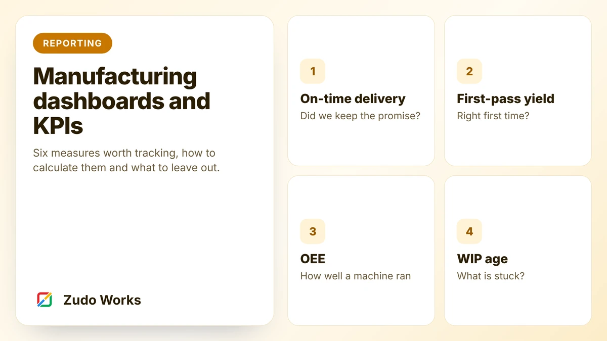
Start with two measures you already hold the data for: on-time delivery and first-pass yield. Add scrap rate, schedule adherence and WIP age once jobs are tracked by stage. Leave OEE until run time and counts are recorded without extra typing. Give each number a written definition, a target and an owner, and review them weekly.
A dashboard is the last thing to build, not the first. It can only show what the business already records, and it only earns its place if someone changes a decision because of it.
This guide picks six measures that suit a small manufacturer, shows how each is calculated and sets out the design rules that keep a dashboard in use after its first month.
How to pick a measure
Put every candidate through three questions:
- Who will act on it? If you cannot name the person, leave it out.
- What will they do when it is bad? If the answer is “nothing we can do”, leave it out.
- Is the data recorded already, as part of the work? If someone must type it in for the report, it will stop being typed in.
Six measures pass those questions for most small factories.
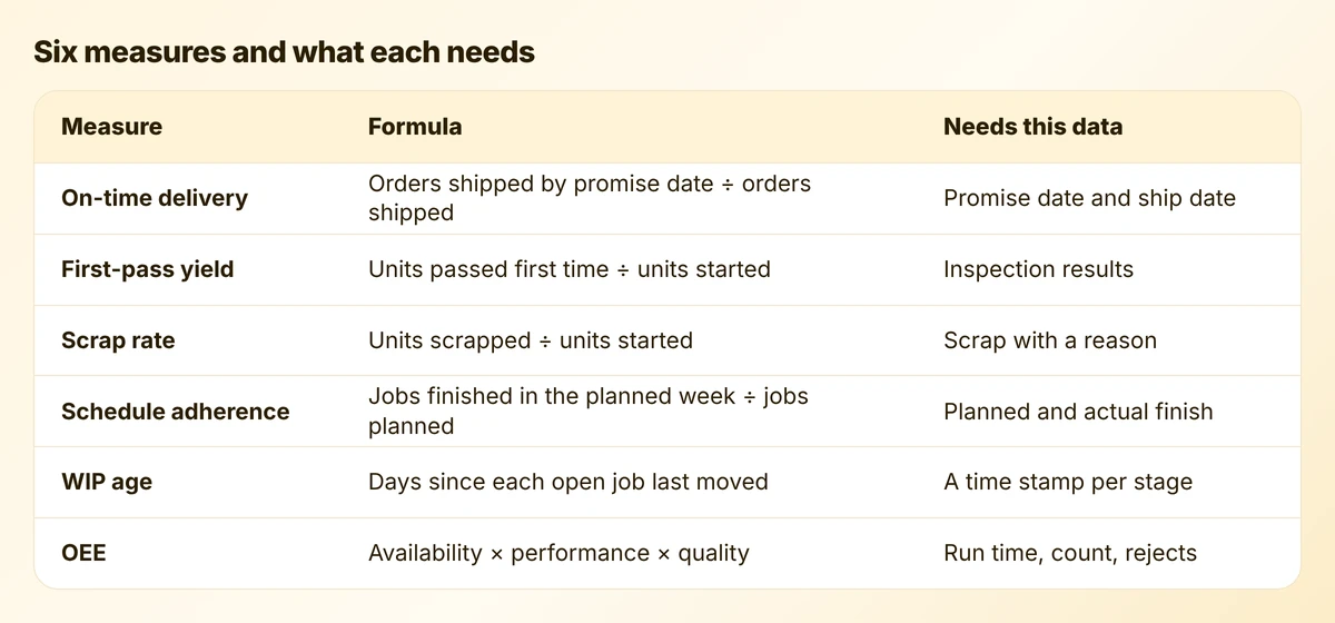
On-time delivery
The customer’s view of your factory in one number. Divide the orders shipped on or before the promised date by all orders shipped in the period.
Two decisions make or break it:
- Which date? Use the date first promised to the customer. If the promise date is moved every time a job slips, the number will always look good and mean nothing. Keep the original date in its own field.
- Whole orders or lines? An order shipped in two parts, one late, is late from the customer’s side. Count whole orders unless customers accept part shipments as normal.
First-pass yield and scrap rate
First-pass yield is the share of units that passed inspection the first time, with no rework. Scrap rate is the share written off. Together they tell you how much of your capacity went into making things twice.
Both depend on scrap and rework being recorded with a reason chosen from a list. A total with no reasons tells you there is a problem and nothing about where. Our guide to inspections, NCRs and CAPA covers the records behind these numbers.
Schedule adherence and WIP age
Schedule adherence asks whether the jobs planned for a week were finished in that week. It measures the plan as much as the floor: a plan that is never met is a poor plan.
WIP age is less well known and often more useful. For every open job, count the days since it last moved to a new stage. Then sort the list with the oldest first.
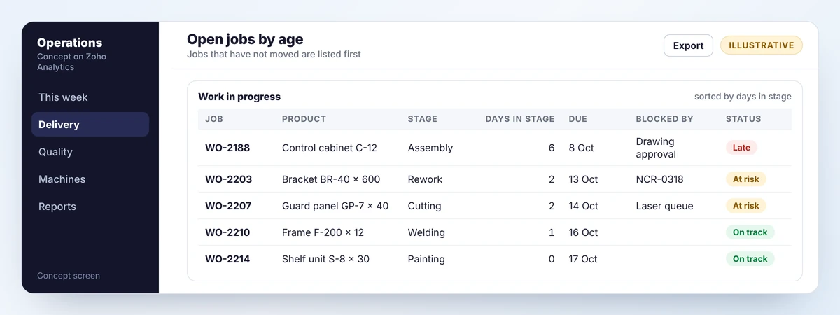
A due-date list shows what is late. A WIP age list shows what is stuck, which is what you can still do something about. It needs one thing: a time stamp each time a job changes stage. That comes free with stage-based production tracking.
OEE, and when to wait
Overall equipment effectiveness combines three ratios for one machine or line over one period.
- Availability: the time it ran, divided by the time it was planned to run.
- Performance: what it made, divided by what it could have made in that run time at its ideal rate.
- Quality: the good units, divided by all units made.
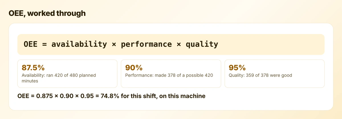
In the example, the machine lost an hour to stoppages, ran a little slower than its ideal rate and rejected 19 units. The total, 74.8%, says little by itself. The three parts say where the loss was: mostly in stopped time.
When to leave OEE alone
OEE needs run time, stop time, counts and rejects per machine. If operators have to write those on a sheet, the figures will be estimates and the number will mislead. Use it for machines where counts come from the machine or from a scan, and only for the one or two machines that limit your output.
OEE also suits repetitive production better than job shops. If every job is different, the “ideal rate” is a guess, and schedule adherence and WIP age will tell you more.
Designing the dashboard
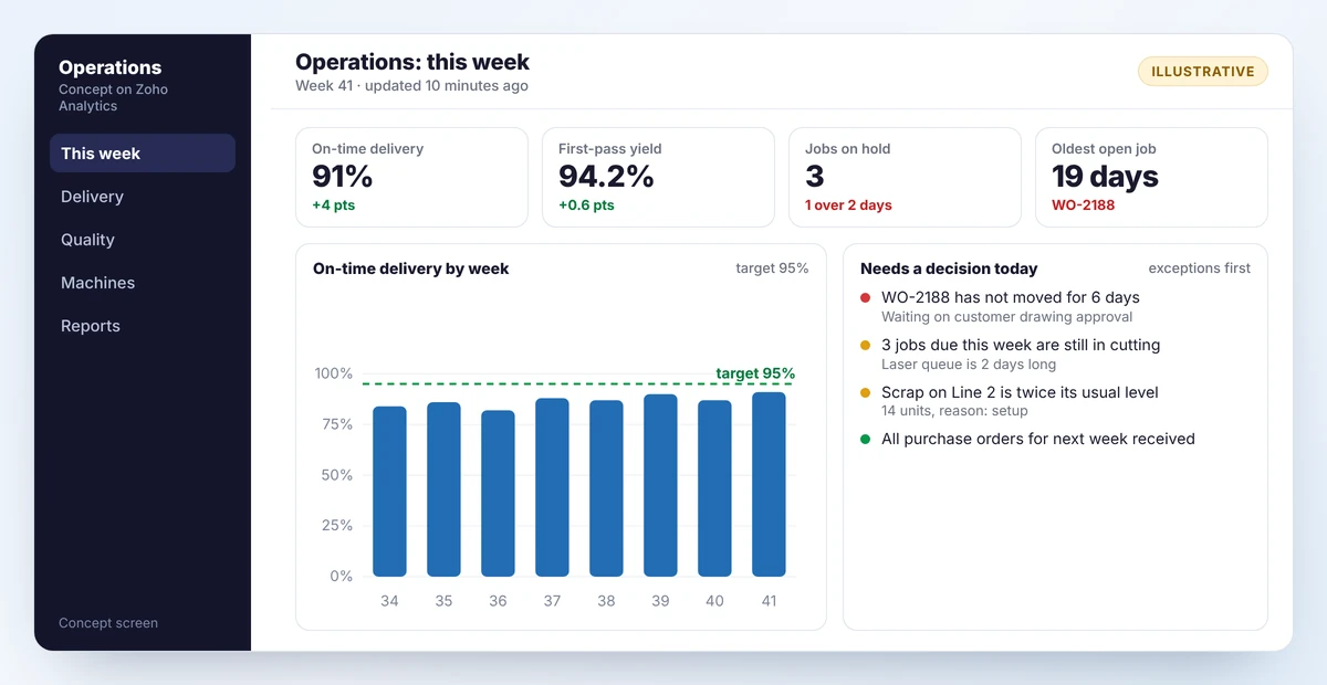
The screen above follows four rules.
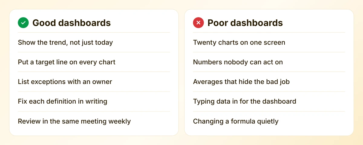
- Few numbers. Four headline figures, each with its change since last period.
- Trends with targets. A single week proves nothing. Eight weeks against a target line shows direction.
- Exceptions as a list. The panel on the right names the jobs that need a decision. A manager can act on a list; a gauge only causes worry.
- Freshness shown. If people cannot tell when the data was updated, they will not trust it.
Different screens for different people
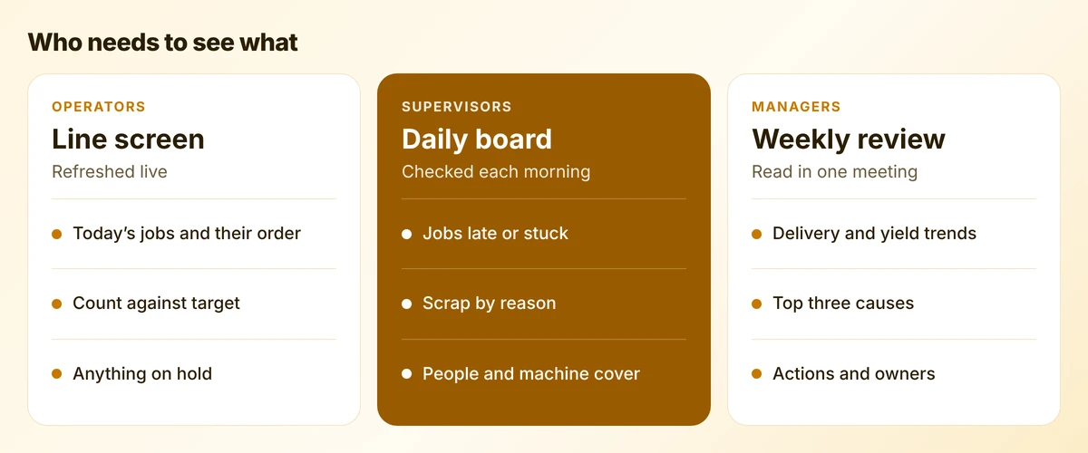
An operator needs to know what to run next and whether the line is ahead or behind. A supervisor needs today’s problems. A manager needs trends and causes. Trying to serve all three with one screen produces something too detailed for the manager and too slow for the operator.
A worked example: from number to action
An example fabricator reviews its dashboard on Monday. On-time delivery has dropped from 90% to 82% in a fortnight.
- The late orders are listed. Seven of nine passed through the laser cutter.
- WIP age shows jobs waiting two days in the cutting queue, where half a day is normal.
- Hold reasons show the laser stopped three times for a nozzle fault.
- The action is a maintenance job and a temporary second shift on the laser, with a named owner and a date.
The dashboard did not solve anything. It shortened the route from “deliveries are slipping” to “fix the laser” from a week of argument to one meeting. That is all a dashboard is for.
Building it
For businesses on Zoho, Zoho Analytics is the usual tool. It connects to Zoho apps and to outside databases and files, schedules reports by email, raises data alerts when a figure crosses a threshold and includes forecasting. Its assistant, Ask Zia, answers questions typed in plain language. Dashboards can be embedded in a Creator app, so supervisors see them where they already work.
Three practical points:
- Write the definitions down before building anything. One page: name, formula, data source, owner, target.
- Build from transactions, not from summaries someone keeps by hand.
- Start with alerts on two numbers. A message when a job has not moved for three days does more than a screen nobody opens.
Mistakes to avoid
- Measuring what is easy. Machine hours are easy to count and rarely what limits you.
- Moving the target date. It hides every late order.
- Comparing people. A league table of operators teaches them to under-report scrap.
- Building before the data exists. If stock or job status is unreliable, fix that first. See our inventory accuracy guide.
A first month
- Calculate on-time delivery for the last three months by hand, from order and dispatch records.
- Write the one-page definition sheet for two measures.
- Build one screen with two numbers, two trends and an exceptions list.
- Review it in the same weekly meeting for a month, and note each decision it led to.
Frequently asked questions
On-time delivery and first-pass yield. Most businesses already hold the data for both, and they cover the two things customers notice: whether the order arrived when promised and whether it was right.
Multiply availability by performance by quality. Availability is run time over planned time, performance is actual output over possible output at the ideal rate, and quality is good units over total units.
Often not at first. OEE suits repetitive production where an ideal rate is known. In a job shop, schedule adherence and WIP age usually say more and need less data.
Yes. It connects to Zoho apps and to other databases, and offers scheduled reports, data alerts, forecasting and a plain-language assistant. The quality of the dashboard depends on the quality of the data recorded underneath it.
Sources
Product capabilities change. We checked these pages in October 2026; confirm anything you plan around.
Related services: Zoho integrations · Zoho Creator development · Manufacturing workflows